
The creator of this poster has clearly stuck to the typical conventions of the genre horror. The lighting of the poster - like the trailer - is dark and eerie which creates an unsettling atmosphere. The setting of the trailer is included in the background. The house looks small and inferior but still extremely ancient and strange. That it is placed so far behind the image of the tree in front could be significant as it could show that the entity is more superior and powerful then the house and those inside. The way the artist represents that the entity is present is by the rope on the tree and the shadow beneath it. The shadow is effective as it is a typical convention of a horror and creates suspense and mystery upon the viewer. The title of the film could be considered to be quite small, but I think the image is so powerful, the size of the font is just right. The names of two other horror films the director has created are also featured on the poster. I think this is important as it gives the viewer a sense of what the film could be like. Also, the tag line under the main title suggests the film is based on true events. This would intrigue the reader more and make them want to watch.
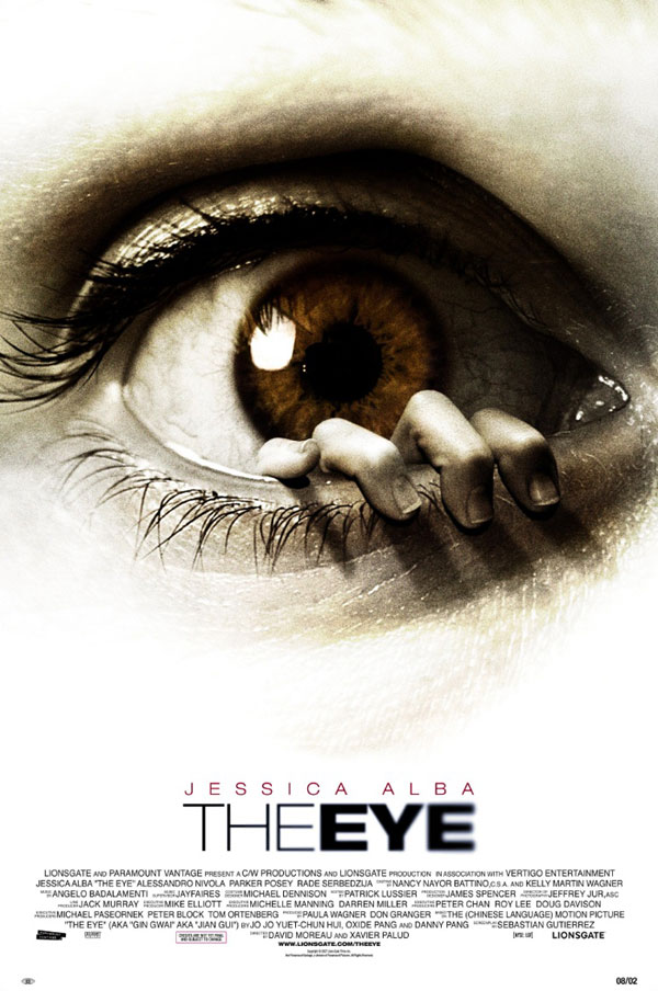
The second poster I chose to analyse was from the film 'The Eye.' The film verges on the horror genre but also has drama and thriller elements. I particularly like this poster as I think the main image is very effective and would attract the viewer's interest. Not only is the image of the eye in sepia-tones creating a mysterious effect, it also looks scared and worried possibly foreboding the actress in the film and therefore making the audience feel suspense and fear also. The main attraction the the image would be the fingers appearing from the eye itself. This could warn the reader of the content in the film and that super natural happenings may occur. In this poster, the image plays a more important role than the title of the film. The text is in all capital suggesting importance, but it placed near the bottom and is much smaller in proportion to the image. The actress' name - 'Jessica Alba' - is placed above the title as she is a well known actress so her importance is shown. That the text is in red could have connotations to anger and danger; possible emotions in the film. I think the use of the image of the eye is effective in creating the 'horror genre' and is a possible idea for my poster.

This is the poster for the film 'The Strangers.' I think this is effective as the artist uses the positioning and blocking of the characters effectively to portray roles of importance. The 'killers' or 'villains' in the film are placed in front of the victims showing their superiority and control over them. The victims are not facing the camera so their identity is not shown. This is effective as it reveals their lack of importance, it could suggest the victims identities do not matter to the killers which is supported by the tag line 'because you were home.' This implies that the killers are ruthless and do not have any real reasons for torturing their victims.The actor and actresses names - 'Liv Tyler' and 'Scott Speedman' - are placed above the title similar to 'The Eye.'
No comments:
Post a Comment